- the colour of the cover (there is another CRWR publication with the turquoise linen cover we chose initially)
- whether the typewriter font would be a good idea for the cover
- whether we should switch the typewriter font to the cover font for the titles, author names & pages in the guts of the book
This image satisfies your questions about the typewriter font on the cover:

Erm... it's green for some reason. Ignore that part. Focus on the typewriter font part.
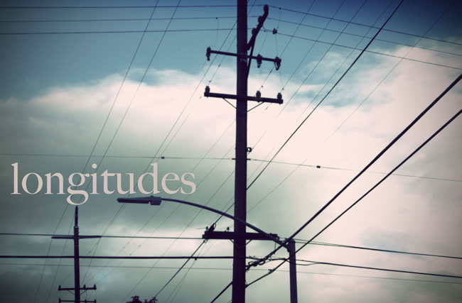
This next image should satisfy the question of switching to Dustimo in the guts:

So there you go. The design team does not like either of these options, to be perfectly honest. Please feel free to stand up for them in the comments, suggest improvements, etc.
Next we'll tackle the issue of the cover colour/design.
Option 1:

Option 2:

Option 3:

Option 4:

Option 4 is the clear winner for us.
Next we have table of contents styles. We preferred either option 1 or option 3. We can talk about this in class; we need to consider whether we want to organize works by genre in the table of contents. This doesn't necessarily mean that they'd need to be organized by genre in the anthology. It might mean that the table of contents does not proceed in a numerically linear fashion. We also need to keep in mind that the table of contents is where we'll do the work of visual linking between the sans serif font on the cover and serif font we're using for titles, names and number in the guts.
Option 1:

Option 2 (both with a dot leader and without):

Option 3:

There you have it.
Let us know what you think in the comments.
I LOVE option 4 for the cover and option 3 (or 1) for the TOC. Seriously fantastic work design team. The minimalism and typewriter font give me a warm, fuzzy, writerly feeling.
ReplyDeleteMy vote is for option 4 for the cover, and option 3 for the table of contents.
ReplyDeleteI like breaking the table of contents out by genre.
I'm with Melissa and Jeff.
ReplyDeleteOption 4 for the cover, and Option 3 for the table of contents.
Good work, team!